来源:宏基因组
写在前面之前分享了3月底发表的的
《水稻微生物组时间序列分析》的文章,大家对其中图绘制过程比较感兴趣。一上午收到了超30条留言,累计收到41个小伙伴的留言求精讲。
我们将花时间把此文的原始代码整理并精讲,祝有需要的小伙伴能有收获。
本系列按原文4幅组图,共分为4节。本文是第二节a,相关分析。图2的散点图和拟合部分内容独立,将在下节2b分享。
前情提要
水稻微生物组时间序列分析
1模式图与PCoA
先了解一下图2的内容。
图2. 微生物组随时间变化的规律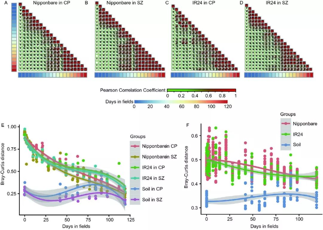
图2. 田间水稻根系微生物组在8-10周趋于稳定。
A-D. 对两个水稻品种分别在两地进行的连续微生物组调查结果相关分析,发现8-10周后群落结构趋于稳定。
E. 所有时间点距离水稻最后取样点的Bray-Curtis距离。发现土壤呈现小幅波动变化,而根系呈现出先快后慢,逐渐趋近的变化规律。
F. 不同水稻品种在两个地点间的距离变化,发现土壤差异稳定,而根系微生物组差异随时间增长而趋于一致。
方法简介:A-D采用R的cor()函数计算pearson相关系数,并使用Corrplot包展示,时间轴使用pheatmap绘制热图展示。
E-F基于vegan包计算的所有样品两两间Bray-Curtis距离。分别挑选距离终点的距离,和两地间的距离与时间序列上的关系,并采用ggplot2可视化散点图,并添加拟合曲线方便观察变化规律。
图2A-D. 相关性corrplotA-D为四个相当类型图,只是分别两个地点的两个品种进行分析,进一步説在不同地点和不同品种的变量下仍然存在稳定的变化规律。这里仅以图2A在北京种植的日本晴水稻品种为例进行代码说明。
输入文件只有实验设计和OTU表,具体文件见文末说明。
清空工作环境和加载包
# Set working enviroment in Rstudio, select Session - Set working directory - To source file location, default is runing directoryrm(list=ls()) # clean enviroment object
library("corrplot")
library("pheatmap")
library(ggcorrplot)
读入实验设计和OTU表
# Public file 1. "design.txt" Design of experimentdesign = read.table("../data/design.txt", header=T, row.names= 1, sep="\t")
# Public file 2. "otu_table.txt" raw reads count of each OTU in each sample
otu_table = read.delim("../data/otu_table.txt", row.names= 1, header=T, sep="\t")
实验设计筛选:这里只筛选昌平的日本晴相关组(A50)
# setting subset designif (TRUE){
sub_design = subset(design,groupID %in% c("A50Cp0","A50Cp1","A50Cp2","A50Cp3","A50Cp7","A50Cp10","A50Cp14","A50Cp21","A50Cp28","A50Cp35","A50Cp42","A50Cp49","A50Cp63","A50Cp70","A50Cp77","A50Cp84","A50Cp91","A50Cp98","A50Cp112","A50Cp119") ) # select group1
}else{
sub_design = design
}
sub_design$group=sub_design$groupID
设置组顺序,这是必须的,否则时间10,100天会位于1的后面。
# Set group orderif ("TRUE" == "TRUE") {
sub_design$group = factor(sub_design$group, levels=c("A50Cp0","A50Cp1","A50Cp2","A50Cp3","A50Cp7","A50Cp10","A50Cp14","A50Cp21","A50Cp28","A50Cp35","A50Cp42","A50Cp49","A50Cp63","A50Cp70","A50Cp77","A50Cp84","A50Cp91","A50Cp98","A50Cp112","A50Cp119"))
}else{sub_design$group = as.factor(sub_design$group)}
print(paste("Number of group: ",length(unique(sub_design$group)),sep="")) # show group numbers
筛选后的实验设计样本与OTU表交叉筛选
# sub and reorder subdesign and otu_tableidx = rownames(sub_design) %in% colnames(otu_table)
sub_design = sub_design[idx,]
count = otu_table[, rownames(sub_design)]
OTU表标准化为百分比,在R中只需一小行代码
norm = t(t(count)/colSums(count,na=T)) * 100 # normalization to total 100按组合并:因为样本太多,一小部分过百个样本,展示太乱,按组求均值,组间比较更容易发现规律
# Pearson correlation among groupssampFile = as.data.frame(sub_design$group,row.names = row.names(sub_design))
colnames(sampFile)[1] = "group"
mat = norm
mat_t = t(mat)
mat_t2 = merge(sampFile, mat_t, by="row.names")
mat_t2 = mat_t2[,-1]
mat_mean = aggregate(mat_t2[,-1], by=mat_t2[1], FUN=mean) # mean
mat_mean_final = do.call(rbind, mat_mean)[-1,]
geno = mat_mean$group
colnames(mat_mean_final) = geno
计算相关系数,并保留3位小数
sim=cor(mat_mean_final,method="pearson")sim=round(sim,3)
先使用ggcorrplot绘制相关矩阵
pdf(file="ggcorrplot_pearson_A50Cp.pdf", height = 2.5, width = 2.5)ggcorrplot(sim, type = "upper", colors = c("green", "yellow", "red")) # , method = "circle"
dev.off()
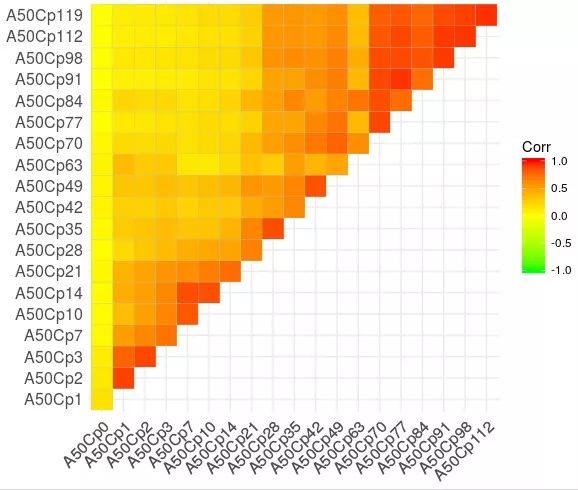
这是ggcorrplot绘制的默认效果,还是很不错的。
详细学习见 R相关矩阵可视化包ggcorrplot
但我个人更喜欢更老的corrplot包。
# 人为设置颜色度col1 <- colorRampPalette(c("green", "green", "red"))
pdf(file="corplot_pie_pearson_A50Cp.pdf", height = 2.5, width = 2.5)
corrplot(sim, method="pie", type="lower", col=col1(100)) # , diag=F , na.label = "1"
dev.off()
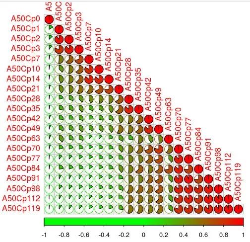
采用corrplot的饼形图样式,颜色为绿至红。
更多教程见:R画月亮阴晴圆缺:corrplot绘图相关系数矩阵
生成图例
col1 <- colorRampPalette(c("green", "red"))corrplot(sim, method="pie", type="lower", col=col1(100)) # , diag=F , na.label = "1"
# 生成时间热图,分别为土和植物的
time1 = c(0,1,2,3,7,10,14,21,28,35,42,49,63,70,77,84,91,98,112,119)
time2 = c(0,41,48,54,62,77,84,90,97,119,0,0,0,0,0,0,0,0,0,0)
time=data.frame(time1,time2)
pheatmap(time, cluster_rows = F, cluster_cols = F)
pheatmap(time, cluster_rows = F, cluster_cols = F, filename = "corplot_pie_legend_time.pdf" ,width=2, height=4)

植物和土壤的时间热图,我们采用pheatmap绘制,再用用AI添加在图中的。
本分析的全部文件和代码,会在 https://github.com/YongxinLiu/Zhang2018SCLS 上持续更新,也可以后台回复“时间序列”获得百度云下载链接。
如果本文分享的技术帮助了你的科研,欢迎引用下文,支持国产SCI越来越好。
Jingying Zhang, Na Zhang, Yong-Xin Liu, Xiaoning Zhang, Bin Hu, Yuan Qin, Haoran Xu, Hui Wang, Xiaoxuan Guo, Jingmei Qian, Wei Wang, Pengfan Zhang, Tao Jin, Chengcai Chu & Yang Bai. Root microbiota shift in rice correlates with resident time in the field and developmental stage. Science China Life Sciences. 2018, 61: 613-621. doi:10.1007/s11427-018-9284-4
来源:meta-genome 宏基因组
原文链接:http://mp.weixin.qq.com/s?__biz=MzUzMjA4Njc1MA==&mid=2247489215&idx=5&sn=cd2ef8ac5bd6b2513e3b07d033889d89&chksm=fab9fc0ecdce7518e14ed8506ab44789484bbc91493dc488fe64c33e592c61758a380a04fb76&scene=27#wechat_redirect
版权声明:除非特别注明,本站所载内容来源于互联网、微信公众号等公开渠道,不代表本站观点,仅供参考、交流、公益传播之目的。转载的稿件版权归原作者或机构所有,如有侵权,请联系删除。
电话:(010)86409582
邮箱:kejie@scimall.org.cn